Design Tokens in Figma with Variables: A Practical Guide
Design tokens are the named values a design system is built from: blue/500 = #3b82f6, spacing/md = 16, radius/card = 20. When designers and developers use the same tokens, a button is primary and spacing/md in Figma and in code, instead of “that blue” and “about 16 pixels”. Figma variables are how you store tokens in Figma.
Two layers: primitives and semantic tokens
Good systems separate what a value is from what it’s for:
| Layer | Example | Purpose |
|---|---|---|
| Primitive | blue/500 = #3b82f6 | The raw palette and scales |
| Semantic | color/primary = {blue/500} | The role a value plays |
Components use the semantic tokens. To change the brand color, you point color/primary at another primitive, and every component follows. In Figma, a semantic variable aliases a primitive.
Naming
Use / to group variables. Figma turns groups into folders:
blue/50 … blue/950,gray/50 … gray/950spacing/xs, spacing/sm, spacing/md …orspacing/1 … spacing/10color/text,color/background,color/primary,color/border
Keep names aligned with your code (for example Tailwind’s blue-500 and spacing scale) so developers don’t need a translation table.
Modes: light and dark
Put semantic tokens in a collection with Light and Dark modes. color/background aliases gray/50 in Light and gray/950 in Dark. Switching a frame’s mode switches the whole design.
Setting it up in Figma
- Open Local variables and create a Primitives collection: color ramps, spacing and radius scales.
- Create a Semantic collection with Light/Dark modes, and alias each token to a primitive.
- Apply semantic variables to your components’ fills, gaps, padding and radius.
The native panel works, but it’s slow at scale: typing 10 shades for 8 colors, editing values one by one, and tracing which token aliases which.
Faster with Winden Tokens
Winden Tokens is a free, open-source Figma plugin for exactly this work:
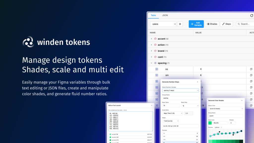
- Spreadsheet-style editing of all variables, with search, type filters, collections and modes, and auto-sync with Figma’s own panel.
- Color shades: generate a full 50–950 palette from one base color, with curves for lightness, saturation and hue. See how to generate a 50–950 color palette in Figma.
- Number scales for spacing and type from ratios (1.2, 1.25, 1.333, 1.618…) with T-shirt, numeric or custom names.
- Nodes view: a graph of which variables alias which, where you create or remove aliases by dragging.
- Bulk editing as CSV or JSON, including import and export of whole token sets.
- Contrast checker with WCAG AA/AAA badges per variable or group.
Install it from Figma: Plugins → Browse plugins in Community, search “Winden Tokens”.
From Figma to code
Once tokens exist in Figma, bring the same names into your CSS. In a Tailwind v4 project they become @theme variables; in WordPress, Winden builds the same scales for Tailwind in its visual Wizard, so design and code use one system.
Manage Figma variables at scale
Winden Tokens: a free Figma plugin for design tokens, with shades, scales, bulk editing, node graphs and contrast checks.
Related guides
- How to Use Tailwind CSS in WordPress: Three ways to add Tailwind v4: CDN, a build step, or Winden.
- How to Use Tailwind CSS in the Gutenberg Block Editor: Classes, design tokens and autocomplete in the block editor.
- How to Use Tailwind CSS in Bricks Builder: Utility classes, autocomplete and tokens in Bricks.
- How to Use Tailwind CSS in Oxygen Builder: Utility classes in Oxygen Classic and Oxygen 6.
Browse all WordPress tutorials.