How to Build Reusable Components Across Gutenberg Blocks
Once you build a few custom blocks, you notice the same pieces everywhere: the button in the hero, the card, the CTA. Copy-pasting that markup means every change has to be made five times, and they slowly drift apart. The fix is the same as in any codebase: components.
Patterns vs components
WordPress has synced patterns (formerly reusable blocks): a group of blocks you insert in several places, where editing one updates all. They’re great for content, like a newsletter box that appears on many pages.
Components are different: they’re pieces of your block code. A button component is used inside the hero block, the pricing block and the CTA block, each time with different text and style. That’s a developer tool, not an editor one.
The plain PHP way
In a custom block setup you can put shared markup in a PHP function or template part:
function my_button( $text, $url, $style = 'primary' ) {
    printf(
        '<a class="btn btn--%s" href="%s">%s</a>',
        esc_attr( $style ), esc_url( $url ), esc_html( $text )
    );
}
Then call my_button( 'Buy now', '/pricing/' ) in each block template. It works; the downside is that the component is invisible to editors and every variation is a hand-typed function argument.
Components with FanCoolo WP Symbols
FanCoolo WP has Symbols: reusable PHP components you create in WordPress and use inside any block with a tag, much like React components.
1. Create the symbol
Add a new item with type Symbols and title it “Button”. FanCoolo generates button.php, and in blocks you’ll use it as <Button /> (PascalCase in blocks, kebab-case files, so “Product Card” becomes <ProductCard />).
2. Give it attributes
In the symbol’s Attributes tab add text (Text) and type (Select with options primary, outline, ghost). Read them in the symbol’s PHP from $symbol_attrs, always with a default:
<?php
$text = $symbol_attrs['text'] ?? 'Button text';
$type = $symbol_attrs['type'] ?? 'primary';
?>
<a class="btn btn--<?php echo esc_attr( $type ); ?>"><?php echo esc_html( $text ); ?></a>
3. Use it in blocks
Put the tag in any block’s PHP, for example <Button text="Get started" type="primary" />. In the editor, a Symbol Attributes panel lists each symbol used in the block. For every field you can type a fixed value, or bind a block attribute, so the button text comes from the block’s own sidebar field.
4. Change it once
Update the symbol and every block that uses it changes with it. Combine symbols (a card that contains a button) to build sliders, accordions and other larger components from small, consistent parts.
Tips
- Start with the three components you repeat most: button, card, section heading.
- Keep symbols dumb: markup and attributes only. Queries and logic belong in the block.
- Share styles through SCSS partials so each component’s CSS lives in one place too. See SCSS in custom Gutenberg blocks.
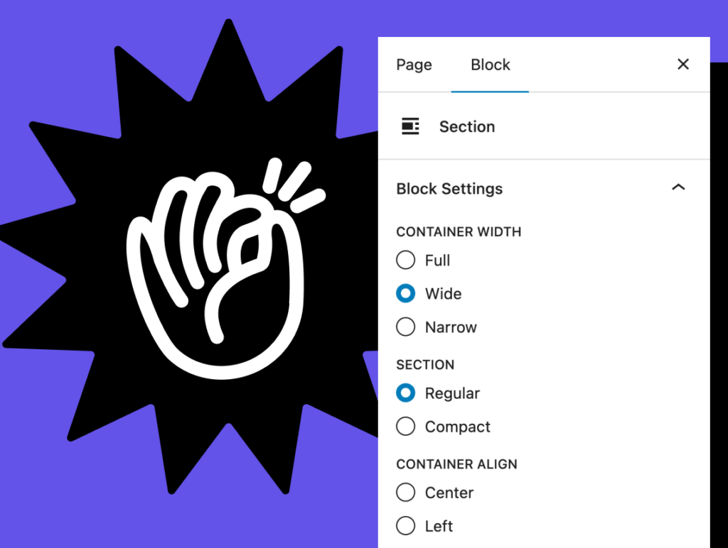
Components for your Gutenberg blocks
FanCoolo WP Symbols: reusable PHP components with attributes, used in any block like a tag.
Related guides
- How to Build Nested Gutenberg Blocks (InnerBlocks) Without JavaScript: Container blocks with InnerBlocks, in PHP.
- How to Add Sidebar Settings to a Custom Gutenberg Block: Fields, toggles, colors and pickers for your blocks.
- How to Create a Custom Gutenberg Block Without React: Build a native custom block with PHP only.
- How to Build a Gutenberg Block That Shows ACF Fields: Show Advanced Custom Fields data in the block editor.
Browse all WordPress tutorials.